Tint tool
Color Contrast Checker
Check WCAG contrast ratios before you ship.
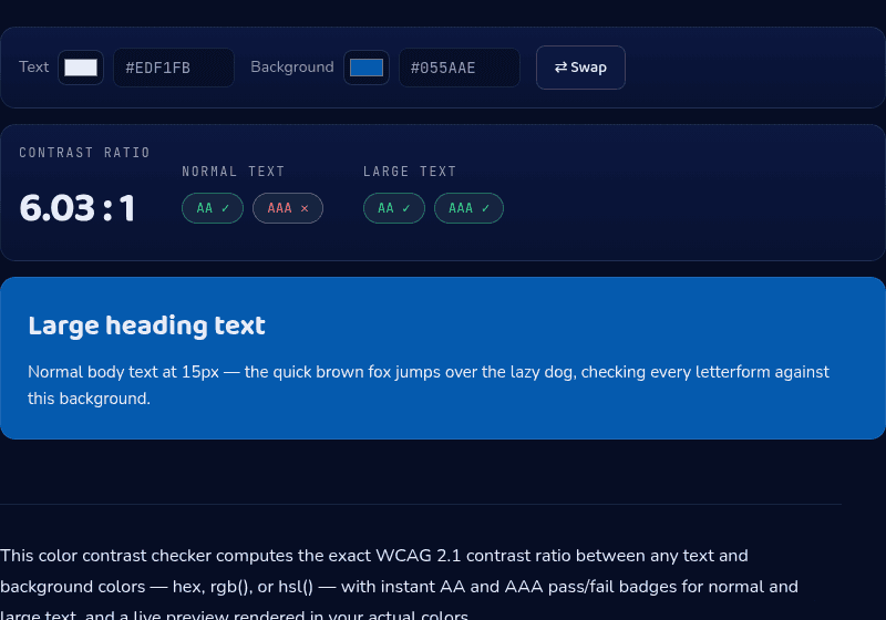
Contrast ratio
6.03 : 1
Normal text
AA ✓AAA ✕Large text
AA ✓AAA ✓Large heading text
Normal body text at 15px — the quick brown fox jumps over the lazy dog, checking every letterform against this background.
How it works
This contrast checker computes the exact WCAG 2.1 contrast ratio between your chosen text and background colors using the standard relative-luminance formula, then checks that number against the AA and AAA thresholds for both normal and large text. The live preview renders real sample text in your actual colors, so you can see the result rather than just read the number.
When you'd use this
- Checking a brand color against body text: verifying that a brand blue or orange used as a background still clears 4.5:1 against white or black text before it ships.
- Auditing an existing design for accessibility: testing each text-and-background pairing already in use on a site to catch failures like light-grey placeholder text before an accessibility review flags them.
- Choosing between a light and dark UI theme: comparing contrast ratios for the same text color against both a light and dark background option to decide which passes more comfortably.
Frequently asked questions
What contrast ratio do I need for accessibility?
For WCAG AA: 4.5:1 for normal text and 3:1 for large text (18pt+, or 14pt bold). AAA requires 7:1 and 4.5:1. UI components like input borders need 3:1.
How is the contrast ratio calculated?
From the relative luminance of both colors using the WCAG formula: (L1 + 0.05) / (L2 + 0.05), where L1 is the lighter color. This checker implements the formula exactly — white on black returns precisely 21:1.
What counts as 'large text'?
18pt (24px) and larger at any weight, or 14pt (about 18.7px) and larger when bold. Large text only needs 3:1 for AA because bigger letterforms stay legible at lower contrast.
Is AA or AAA required by law?
Regulations like the ADA (via referenced standards), Section 508, and the European Accessibility Act generally point to WCAG Level AA. AAA is an enhanced target, usually applied selectively rather than site-wide.
From the blog
Related tools