
WCAG Color Contrast Explained: What 4.5:1 Actually Means
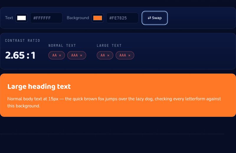
White text needs a 4.5:1 contrast ratio against its background to pass WCAG AA for normal-size text, or 3:1 if the text is large (18pt+, or 14pt+ bold) — and that ratio depends entirely on the specific background color, not just "is it dark enough." White on a vivid orange like #FE7825, for instance, only reaches about 2.65:1 and fails outright, which is a more common trap than most teams expect from a brand color that looks plenty dark in isolation.
WCAG's contrast requirements are the correction for a real blind spot — designers systematically overestimate how legible low-contrast text is, because we review our own work on calibrated screens, at full attention, with good eyes. Here's how the ratio is calculated, what every threshold means (including the button and UI-component rules people usually miss), the failures that catch real teams, and how to fix a failing pair without abandoning your brand colors.
The ratio, in plain terms
Every color has a relative luminance — roughly, how much light it emits, weighted for the fact that human eyes are far more sensitive to green than to red or blue. The WCAG formula linearizes each RGB channel, weights them (about 21% red, 72% green, 7% blue), and sums them into a single brightness number.
A contrast ratio compares two luminances: (L1 + 0.05) / (L2 + 0.05), lighter color on top. Identical colors score 1:1; pure black on pure white scores the maximum, 21:1. The 0.05 terms model ambient light reflecting off a real screen — even "black" pixels aren't truly dark in a lit room. The intuition survives all the math: bigger number, easier to read.
Every threshold that matters
Level AA — the standard referenced by most laws and audits — requires 4.5:1 for normal text and 3:1 for large text. Large means 18pt (24px) and up at any weight, or 14pt (about 18.7px) and up when bold; bigger letterforms stay legible at lower contrast, so they get a discount. Level AAA, the enhanced tier, raises the bars to 7:1 and 4.5:1.
Since WCAG 2.1's success criterion 1.4.11, non-text elements need contrast too: button borders, input outlines, checkbox and toggle boundaries, focus indicators, and meaningful icons or graphics must hit 3:1 against their adjacent background. A filled button with no separate border is covered by the same rule differently — if the button's own fill contrasts 3:1 against the page background, that satisfies it without needing a drawn border at all. Purely decorative elements, logos, and disabled controls are exempt.
For calibration: #767676 grey on white sits almost exactly at 4.5:1 — the lightest grey that passes AA for body text. The popular #999999 scores 2.85:1. Fails. A few more anchors worth memorizing: black on white is 21:1, mid-blue link color #0000EE on white is about 9.4:1, and the 3:1 large-text floor is roughly #949494 on white — visibly light, which is why the large-text discount exists at all.
The failures that catch real teams
White text on saturated brand colors is the classic: white on a vivid orange like #FE7825 manages only about 2.2:1, and white-on-brand fails constantly across the mid-lightness range where brand colors live. The fix is usually flipping to near-black text, or darkening the background several steps.
Other repeat offenders: placeholder text (grey-on-grey by convention, almost always failing), text over photos and gradients (the ratio must hold at the lightest point under the text, not on average — add a scrim), thin font weights (a 300-weight font at exactly 4.5:1 reads worse than the math suggests; treat the ratio as a floor), and disabled-looking greys used for enabled controls.
AA or AAA — and is it legally required?
Regulations generally point at AA: the ADA's web guidance, Section 508 in the US, the European Accessibility Act, and most national equivalents reference WCAG Level AA. AAA is an enhanced target that even the W3C doesn't expect entire sites to meet — it's applied selectively, for reading-heavy contexts and audiences with low vision. A defensible policy for most products: AA everywhere as a hard rule, AAA for long-form body text where you can afford it.
Dark mode flips the problem
The same ratios apply in dark mode, but the failure pattern inverts. Pure white text on pure black passes at 21:1 yet causes halation — bright glyphs blooming against the dark — so dark themes conventionally soften both ends: off-white text (this site uses #EDF1FB) on very dark surfaces rather than absolutes. The trap is the middle layers: dark themes stack surfaces at slightly different darknesses, and muted text on a raised card can quietly slip under 4.5:1 even when the primary text passes. Saturated brand colors also behave differently on dark — many that fail against white pass against near-black, which sometimes rescues a brand accent dark mode couldn't use on light.
A repeatable fixing workflow
When a pair fails, don't abandon the hue — move its lightness. Generate a ramp of your color with the Color Shades tool, then walk the steps until the pair passes: darker steps for text on light backgrounds, lighter tints for backgrounds under dark text. Because the hue never changes, the fixed pair still reads as your brand.
Then verify the exact numbers in our Contrast Checker — it accepts hex, rgb(), or hsl(), computes the WCAG formula precisely (white on black returns exactly 21:1), shows AA/AAA pass-fail badges for both text sizes, and previews real text in your actual colors. Check every recurring pair once, record the passing combinations in your design tokens, and the problem stays solved. If a pair fails WCAG and still looks perfectly readable to you, that's a real, documented gap in the formula — not a bug in the checker.