Small Text Generator: Superscript, Small Caps, and Subscript
ᵗⁱⁿʸ ᵗᵉˣᵗ has become its own tone of voice online — the quiet aside, the whispered afterthought, the detail you want present but not shouting. It also survives being pasted into apps with no font controls, which is why it spread so fast through bios and usernames.
This is how small text actually works: where the miniature letters come from, the three distinct styles, why some of your letters come out full-sized or as boxes on certain devices, and when to avoid it.
Borrowed from phonetics and chemistry
Nothing is being scaled down. Unicode contains small letterforms created for technical fields, and small text generators repurpose them. Superscript letters come mainly from phonetic notation, where a raised ʰ marks aspiration in pronunciation guides. Small capitals come from the International Phonetic Alphabet too, where ɢ and ʀ denote specific sounds. Subscripts come from mathematics and chemistry, the same characters used in H₂O.
Because each tiny letter is a genuine character rather than a formatting instruction, the size travels with the text. Paste it into a bio, a chat, or a document and it stays small.
The three styles compared
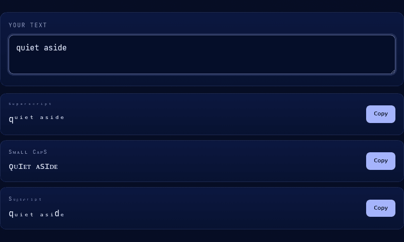
Superscript (ˢᵘᵖᵉʳˢᶜʳⁱᵖᵗ) sits raised above the baseline and is the smallest of the three — the classic whisper effect, and the most complete alphabet available. Small caps (sᴍᴀʟʟ ᴄᴀᴘs) use uppercase letterforms at roughly lowercase height, sitting normally on the baseline; they read as sleek and formal rather than cute, and they stay legible at small sizes better than superscript does. Subscript (ₛᵤᵦₛ𝒸ᵣᵢₚₜ) hangs below the baseline and has the most gaps.
For a bio you want people to actually read, small caps is usually the right choice. For decorative accents around a normal-sized name, superscript works better. Our Tiny Text tool shows all three from one input so you can compare directly.
Why some letters stay big
This is the question every small text generator gets asked, and the answer is unavoidable: Unicode never intended these as complete alphabets, so some letters simply do not exist in small form. Superscript is missing a proper q. Subscript is the worst offender — it covers only a, e, h, i, j, k, l, m, n, o, p, r, s, t, u, v, x, leaving b, c, d, f, g, q, w, y, z absent entirely.
When a letter has no small counterpart, a generator has two options: leave it full-sized, or substitute a lookalike from another block that may not match visually. We leave it unchanged, because a consistent word with one full-size letter reads better than a word with a mismatched impostor. If your text comes out uneven, try a different word or switch to small caps, which covers the full alphabet.
A separate, unrelated problem is boxes: if a letter renders as a small square instead of the correct glyph, the character reached the device fine but the device has no font installed that can draw it — a rendering gap called 'tofu,' common on older phones, some Android keyboards, and plain-text email clients. There's no fix on your end beyond switching styles; small caps has the broadest device support of the three, and superscript the second-broadest.
Where tiny text lands well
Instagram and TikTok bios, where it adds a secondary line without competing with your main text. Discord nicknames and status lines. Twitter or X display names as a subtle suffix. Playlist and profile descriptions. It is particularly effective for the small-print effect — pronouns, a location, a tagline sitting quietly under a normal-sized name.
One practical benefit over other styled text: because small text is visually quiet, it rarely reads as spammy the way heavy decoration can.
The accessibility problem
Small text is the worst of the Unicode styling tricks for screen readers. Phonetic characters have long technical names, and reading a word letter by letter as modifier letter small e, modifier letter small x is genuinely painful. Combine that with the fact that these characters render below the comfortable reading size for many people with low vision, and tiny text becomes actively exclusionary if you put real information in it.
The rule that keeps you honest: never put anything in small text that a reader would be worse off missing. Decoration only, never your only copy of an important detail.
Mixing tiny text with other styles
Small text combines well because it is understated. A bold script name with a small caps tagline beneath it is a common, clean pairing — generate the script in our Fancy Text tool and the caps here. Superscript also works as decorative framing around fullwidth aesthetic text from the Vaporwave tool.
Watch your character budget when mixing: Instagram bios cap at 150 characters, and each tiny letter still counts as one full character despite looking half-sized. Paste your draft into our Word Counter if you are close to the limit.
Why it looks different on iPhone and Android
Small text is more device-dependent than other Unicode styles, because these characters live in blocks that system fonts cover inconsistently. iOS renders the full superscript and small caps sets cleanly. Most current Android builds do too, but older devices and some manufacturer skins miss individual characters, showing a box or falling back to a mismatched glyph that sits at the wrong height.
Desktop is generally safest, and web browsers usually substitute a fallback font rather than showing boxes. Practical advice: check your styled bio on a phone before committing to it, since that is where most people will read it.
Shrink your text
Type into the Tiny Text tool and copy whichever of the three styles fits — superscript for whispers, small caps for clean formality, subscript for the dropped-below effect. It runs entirely in your browser, so nothing you type leaves the page. Not every platform renders it the same way — see where tiny text actually works and where it gets blocked before you commit a whole bio to it.