
CSS Gradient Generator Guide: Linear, Radial, and Conic
If a CSS gradient isn't showing up at all, the cause is almost always one of three things: the element has no set width or height so there's nothing to paint the gradient onto, the gradient was applied to the wrong property (background-color instead of background or background-image), or there's a syntax typo — a missing comma between color stops is the single most common one. Check those three before anything else.
Gradients went from a 2010s design taboo back to everywhere — hero backgrounds, buttons, gradient text, soft mesh-style glows behind product screenshots. CSS ships three gradient functions, all universally supported, and they share one grammar: a direction, then a list of color stops. Learn that grammar once and a css gradient generator becomes a speed tool instead of a crutch.
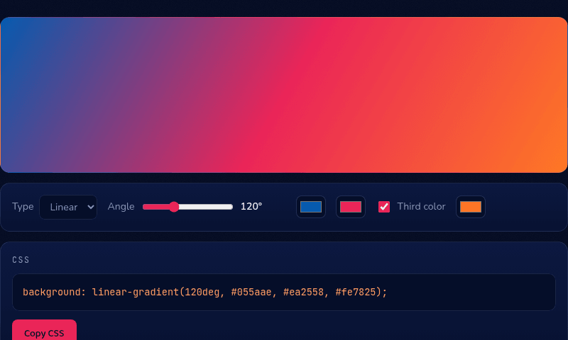
linear-gradient: the workhorse
background: linear-gradient(120deg, #055aae, #ea2558, #fe7825) paints color along a straight line. The angle reads like a compass: 0deg travels bottom-to-top, 90deg left-to-right, 180deg top-to-bottom — the gradient moves toward the angle. Keyword directions also work: to right, to bottom left.
Everything after the direction is a color stop. Unpositioned stops space themselves evenly; add percentages to take control — linear-gradient(90deg, #055aae 0%, #ea2558 30%, #fe7825 100%) pins the crimson early so most of the run blends crimson-to-orange. Gradients are technically background images, so they layer: you can stack a translucent gradient over a photo in one background declaration.
Why your gradient isn't showing
Gradients paint through background or background-image, never through background-color, border-color, or any other color property — applying it to the wrong one is a common copy-paste mistake when adapting someone else's CSS. The element also needs an actual width and height (or content that gives it one); a gradient on a zero-height div is invisible because there's no box to paint it into.
After that, check the syntax itself: every color stop after the first needs a comma before it, and a missing one silently breaks the whole declaration in most browsers rather than throwing a visible error. If the gradient still isn't appearing, paste the exact line you're using into a generator like the one below and compare it stop-by-stop against what it produces — that catches typos faster than reading your own code.
Hard stops: stripes, splits, and flags
The most useful non-obvious trick: two stops at the same position create a crisp edge instead of a blend. linear-gradient(90deg, #055aae 50%, #fe7825 50%) is a clean two-tone split — no blur. Chain the technique and you get stripes, progress-bar fills, and flag patterns with zero images: linear-gradient(90deg, #ea2558 0 33%, #ffffff 33% 66%, #055aae 66% 100%). Combine hard stops with background-size and repeat for patterns like ruled lines and checkers, all in pure CSS.
radial-gradient: glows and spotlights
radial-gradient(circle, #fe7825, transparent 70%) radiates from a center point outward — the tool behind every soft glow. Park a large, mostly-transparent radial behind a hero and you get atmosphere for one line of CSS: background: radial-gradient(800px 400px at 20% 0%, rgba(5, 90, 174, 0.25), transparent 60%). The first values size the ellipse, at positions the center, and fading to transparent lets it sit over any background. Multiple radials layered in one declaration create the multi-glow "mesh gradient" look without any tooling.
conic-gradient: sweeps, charts, and spinning borders
conic-gradient sweeps color around a center like a clock hand: conic-gradient(from 0deg, #055aae, #c43592, #fe7825, #055aae) — repeating the first color last closes the loop seamlessly. With hard stops it becomes a pure-CSS pie chart: conic-gradient(#ea2558 0 40%, #fe7825 40% 70%, #055aae 70% 100%), clipped to a circle with border-radius.
It's also the engine behind the animated rotating-border effect on modern SaaS cards: a conic gradient with a bright segment, masked to a 1px ring, spinning via an animated custom angle property — the effect looks elaborate but is under ten lines of CSS. Our own featured tool cards on the homepage use exactly this technique, so you can inspect a live example.
Gradient text and animation
For gradient text, paint the gradient as the element's background, clip it to the glyphs, and hide the text color: background: linear-gradient(120deg, #8fb8f2, #fe7825); -webkit-background-clip: text; background-clip: text; color: transparent. All modern browsers support it — this site's own headline uses it.
CSS can't smoothly animate between gradient color values, but two standard tricks fake it perfectly: oversize the gradient (background-size: 300% 100%) and animate background-position for a flowing blend, or register a custom @property angle and animate it for spinning conics. Wrap either in a prefers-reduced-motion media query so users who disable animation get the static version — one line of respect that accessibility audits increasingly check for.
Browser support and performance
Support is a non-issue in 2026: linear and radial gradients have worked everywhere for over a decade, and conic-gradient has been in every major browser since 2020 — no prefixes, no fallbacks needed for any audience you're realistically serving. Performance is nearly free too: gradients are GPU-rendered and typically cheaper than the image files they replace, with zero network cost.
Two practical cautions. Very large, very subtle gradients can band on 8-bit displays — visible stripes where smooth blending was intended; adding a third in-between stop or a whisper of noise texture hides it. And animating gradients via background-position repaints continuously, so keep flowing-gradient animations to hero-sized elements rather than full-page backgrounds.
Fixing the muddy middle — and skipping the syntax
Blending distant hues passes through desaturated middle values in RGB interpolation — the grey-brown dead zone in a blue-to-orange gradient. The fix is a vivid third color stationed mid-journey: blue → crimson → orange stays saturated the whole way, which is why sunset gradients need three stops.
For the everyday two-color case with an angle dial and instant copy-paste CSS, use our CSS Gradient tool. When you need a positioned middle color or a conic sweep, the 3-Color Gradient tool adds a movable middle stop and all three gradient types — and the Color Palette generator's Gradient Stops formula will pick the in-between colors for you.